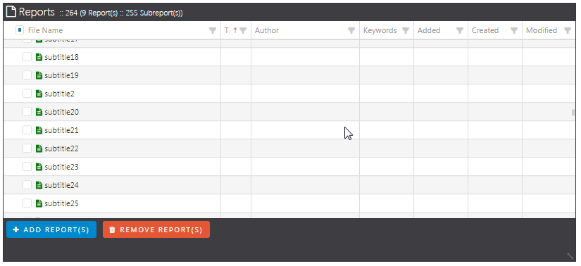
If you have more than about 6 DSNs, a sneaky scroll bar is available at the right side, but its very faint (ok, so I’m getting old) and does not always react timely to a mouse-over (but I’m still quick).
I have some 200 reports to migrate so I’m recommend opting for production workflow efficiency vs UI coolness.
The scrollbars have been redone and both on the main portal and the Change Data Source you should now have an easier time with them.
An update to the servers was made a few minutes ago. Please logout, clear your cache, and log back in to try again. Please let us know if this resolved the issue for you and if yes, mark the response as an accepted solution.
If you leave your mouse (hover) over the area of the scroll bar, it will automatically show a wider version of the scroll bar which should make scrolling easier. This was done to get a little more room for the width of the grid without having to use that space for a scroll bar all the time.